

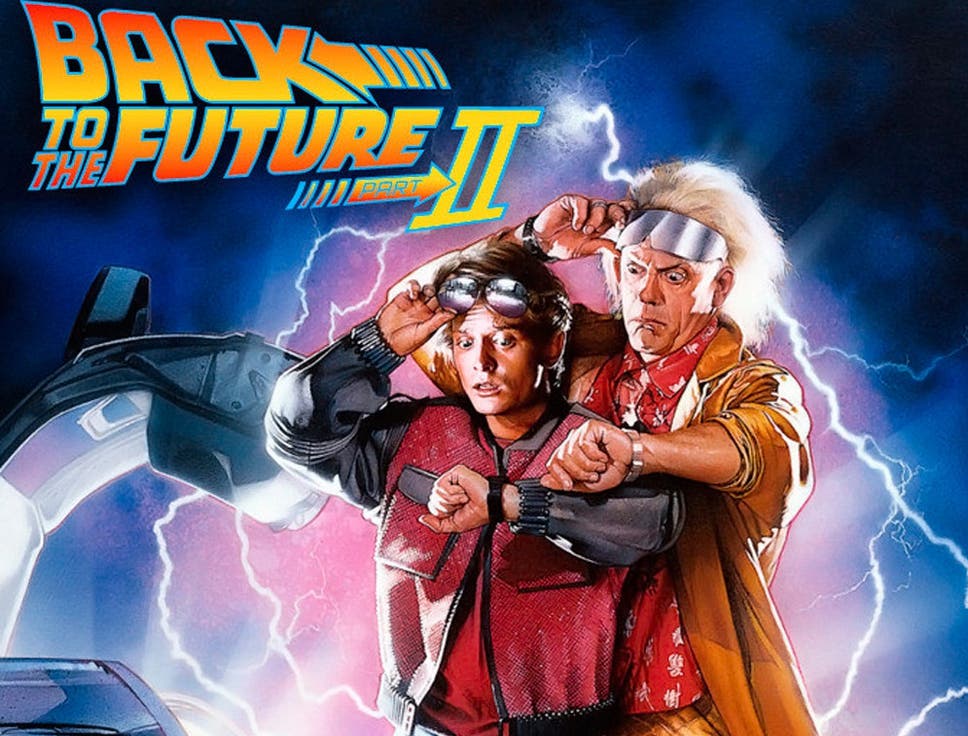
 Today I want to take you back to the future. Well, not really. I want to talk about the movie, Back To The Future, and Back To The Future II. In the movie, Back To The Future II, Marty McFly and Doc Brown travel to 2015, but in that movie, they got a few things wrong when it comes to predicting the future. In an article I read, there are three core things that they totally missed…
- Number one, the Internet. 2015 and NO Internet?
- Secondly was mobile phones. Okay. Mobile phones, AND the internet, duh.
- Finally is that people were still reading newspapers?
But that's not what this post is really about. (OK maybe it IS about the internet and Social Media).
The closing song from the original Back To The Future movie was done by Huey Lewis and the News, and that song was The Power Of Love. But this is really about social media graphics and another Huey Lewis Song, called It's Hip To Be Square.
 Now, when I am talking about graphics, I don't normally like to get into the weeds, because things change so fast. Since I'm working on a couple of training classes, one for a product called Planable, which is a social media posting tool, and another one which is on Canva and Word Swag. These are both being written as webinars and online classes.
Stick with me till the end for my final best graphic formatting options, but there's a lot of data in here. So, bear with me.
One of the first things that people tend to get confused is DPI versus PPI, print resolution versus screen resolution, and that kind of stuff. So, let me define that first.
DPI… PPI… Why?
 DPI is dots per inch, usually associated with printing. PPI is pixels per inch, usually associated with screens. So, when someone says a graphic is a high resolution, it usually means that it's 300 DPI, which is suitable for printing. When somebody says screen resolution, they usually mean 72 DPI, but it's really PPI. It's pixels per inch. That is screen resolution. But when you sit here and look at screen resolution, 72 DPI, an inch, is pretty small. If you take a graphic that's 100 pixels by 100 pixels and 1,000 pixels by 1,000 pixels, they're gonna look vastly different. The reason is a lot of people will take a small image, 100 pixels and try to blow it up, and you'll notice that it gets all fuzzy. That's because it's taking those pixels, and stretching them out, and extrapolating them, where a thousand pixels by a thousand pixels graphic can be shrunk down, and as you shrink it, it actually either gets clearer or better defined. So, that's one thing you have to think about.
Screen Sizes

The next piece of information is the screen sizes. What are the sizes of the screens we are looking at these pixels on? The average screen size of computers, in general, is 1,024 by 768 pixels. It's a pretty common size, but a popular screen size right now is 1,366 pixels by 768. Why? Well, HDTV which has an aspect ratio of 16×9.
But if you look at an iPhone or any one of your mobile phones today, let's say an iPhone X, their resolution is top to bottom. So, the bigger number, the 2,436 pixels, is top to bottom, and 1100 by 25 pixels is with. If you turn the screen to sideways, it kind of replicates what you're going to see on a desktop monitor (or HDTV) nowadays.
Social Posting

Now, I want to dig into social posting. What are the optimal sizes for this? Again, if you can't take notes, I will put a link in the show notes on BaconPodcast.com of a blog post I found on SproutSocial that will give you all of these details. The reason I want to do that is that by the time I finish this post, everything I tell you could be different. That's how fast social media changes nowadays. So, check out the link at BaconPodcast.com, and you will find the most current stats. What I'm going to do is look at the top four posting platforms. These also happen to be the platforms that Planable uses, so that's one of the main reasons I will use these numbers.
 Let's start with Facebook. Now, I'm not going to get into the header graphics or your profile picture. When Facebook is putting together an image in a newsfeed, these are the graphics that you want to post for content. The regular size or the recommended upload size of graphics for Facebook is 1,200 by 630 pixels. When it appears in the newsfeed, it actually gets shrunk down to 470 by 246 pixels. So, what you have to be aware of, it will post a rectangular graphic.
 Next, we'll move on to Twitter. Twitter's maximum size that you can put is 1,024 by 512. that is a 2 to 1 ratio, so it's twice as wide as it is tall. When it's shown in the newsfeed, it's optimized down to 440 by 220. Again, you've got a wide graphic. Even if you upload a square graphic, Twitter will show the whole graphic if you click on it but not in the news feed.
 Now, Instagram is a little different. Instagram is square, so they say that the maximum size that you can post is 1,080 by 1,080 pixels. Instagram will take that and square it down to 612 by 612 pixels, so they actually size that back. And when it's displayed in a newsfeed, it's done at 510 by 510 pixels. Instagram is the unique one that is square.
 Now, we move on until LinkedIn. The recommended size for LinkedIn images … and this is for links. So, If you're posting a link inside of your post, it's going to pull in that image. The way that it's going to grab it is 1,104 pixels by 736 pixels. When it appears in your newsfeed, it's going to show up as 552 pixels by 289 pixels. So, again, you've got a rectangular graphic. As you can see, three of the four top social media platforms take whatever image, it could be square, it could be tall, and it's going to shrink it down to a rectangular vertical type graphic, except for Instagram.
Final Thoughts
 This is where the Huey Lewis song comes in because it's Hip to be Square. If I post directly onto any of these social media platforms, I can post a square graphic, and it will show. What I'm talking about in the rectangular sizes is how these platforms interpolate the graphic and show it in the newsfeed, if it is a linked image inside of a blog post, or an article, or something along those lines. Based on what I've told you, the optimum size for any graphic that you're creating is going to be 1,200 by 1,200 pixels. That fits all the requirements for all of the platforms so that you can post at the optimum resolution. I can't imagine what it's going to be like in 2025, but it's certainly not going to be reading newspapers and no internet.
I would love to hear your thoughts on this. Comment below and share your thoughts, ideas or questions about showing the concepts presented. Have you had to overcome any of the presented concepts? What worked and what did not live up to expectations? Do you have any ideas or advice you could share?
To learn more about this and other topics on Internet Marketing, visit our podcast website at http://www.baconpodcast.com/podcasts/


